Case study
Premium Experience Redesign of CharlotteTilbury.com
A premium, personalised and more intuitive shopping experience across the homepage, product listing pages and inline merchandising.
- Role
- Lead Product Designer
- Responsibility
- Led a cross-functional redesign of the homepage, product listing pages and inline merchandising components to elevate the digital brand experience and address critical UX gaps identified through data and Baymard benchmarking.
- Teams
- Digital Design, Product Design, Content, Engineering
- Timeline
- 2 months
- Outcome
- Delivered a cohesive site-wide visual upgrade and streamlined customer journey, improving clarity, discoverability and overall experience quality.
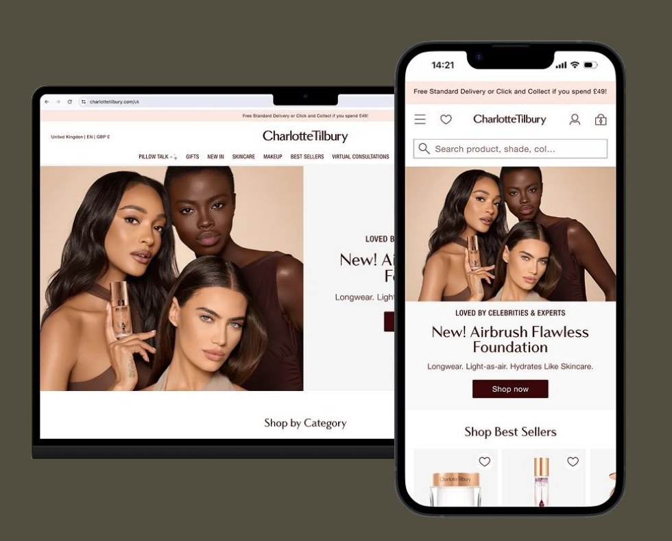
Aligning to Amazon. Simplifying UX. Driving performance.
In September 2025, following the launch of Charlotte Tilbury's first-ever Amazon US storefront, I led a full homepage redesign under a two-month deadline. The goal was to align more closely with Amazon's clarity and product-forward structure whilst maintaining our premium brand positioning.
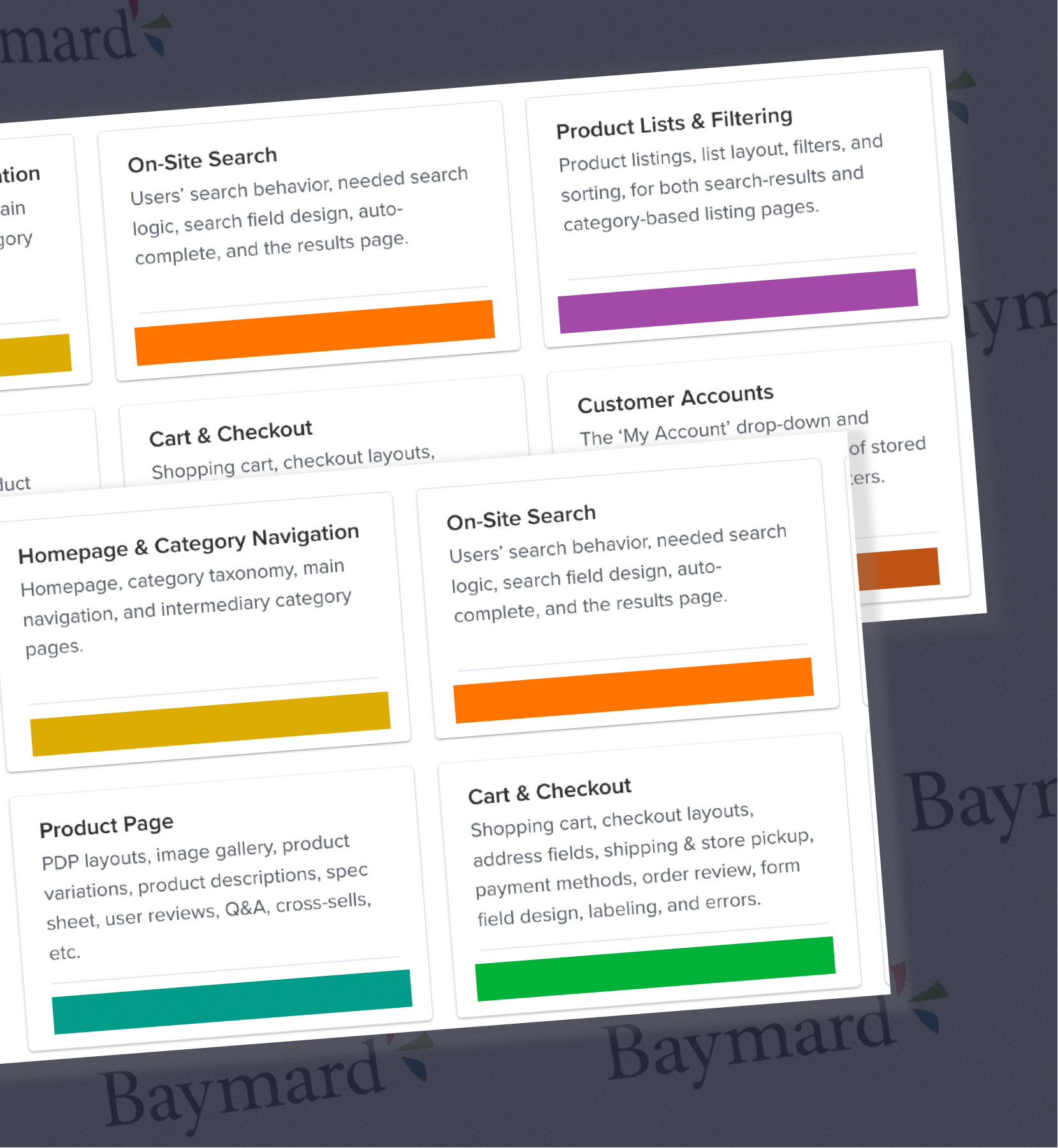
Using insights from our Radical Homepage experiment and the Baymard UX audit, I restructured the homepage to prioritise category discovery, reduce visual noise and personalise the experience by new versus returning users.
1. Homepage redesign
To move quickly, I broke the redesign into two workstreams.
Front-end / UI adjustments — low development effort
- Hero simplification
- Typography changes
- Carousel styling refinements
- Modular offer restructuring
Contentful-driven changes — in partnership with the Content team
- Reordering category boxes
- Updating copy hierarchy
- Simplifying messaging
- Elevating high-performing categories
Rationale behind the changes
To ensure speed didn't compromise strategy, I anchored every decision in data and UX best practice.
From testing we knew
- New users convert better when entering category journeys
- Returning users need relevance
- Excessive trade content and carousels felt overwhelming and click-bait-like
From Baymard research and the UX audit we knew
- Categories improve product findability
- Ad-like homepage content reduces trust
- Carousels are frequently overlooked
- Wizards such as shade finders are often buried
Hero banner and product carousel
Always-on category banners and trade offers
Shade finders, services and brand storytelling
Establishing governance and clear ownership
To prevent the homepage reverting to reactive updates, I introduced a clear governance framework. I aligned Content, Trade, Copy and Digital Design on what can and cannot change, clear module ownership and defined design constraints.
Design now owns the visual system and hierarchy. Trade activates within a structured commercial module. Content works within UX guardrails. This reduced cross-team friction and ensured the homepage evolves without compromising usability or brand integrity.
How has it performed?
Compared to the two months prior, the global homepage CTR increased significantly post-launch. Structural clarity translated directly into performance.
The primary drivers
- Direct PLP linking from top category boxes
- Simplified, clearer hero banner design
2. PLP redesign and navigation optimisation
Alongside the homepage redesign, I updated the product listing pages with refreshed typography and reworked the filter wheel navigation.
Without traditional filtering and sorting available, I transformed the navigation into larger, visual square category links that direct users to key sub-categories — making it easier to narrow down options and improve product discovery.
I also delivered elevated, luxurious imagery that clearly represented each category, ensuring the experience felt premium while remaining intuitive and easy to navigate.
Results
Since launch we've seen a notable increase in overall CTR, and the navigation wheels are now being used as intended — to move between product listing pages.
Top-performing navigation wheel interactions
- Face on Makeup PLP: 33.75% CTR
- Eyeshadow on Eyes PLP: 21.39% CTR
- Lips on Makeup PLP: 19.41% CTR
- Eyes on Makeup PLP: 18.57% CTR
- Blush on Face PLP: 17.20% CTR
Global PLP CTR uplift
- September–October: 16.86%
- October–November: 21.20%
Impact
The structural improvements not only clarified navigation but directly improved engagement across category journeys.
3. Inline ad optimisation on PLPs
PLP inlines were inconsistent, cluttered and often irrelevant — overpowering the product grid. I audited all placements and introduced a structured design template with fixed copy limits and consistent hierarchy.
Each inline was reassigned to the most relevant PLP to support, not interrupt, the user journey.
Performance impact
Since launch we've seen a strong uplift in overall CTR, with utility-led inlines performing the best.
Top-performing inline banners
- Foundation Shade Finder: 7.33% CTR
- Luxury Holiday Gifts: 5.71% CTR
- Lipstick Finder: 3.74% CTR
- Fragrance Finder: 3.40% CTR
- AOV Driver: 3.14% CTR
Impact
Finders — which directly support decision-making — consistently outperformed promotional banners, reinforcing the value of relevance over volume.
Outcome
The redesign created a clearer framework for the Charlotte Tilbury digital experience, bringing together brand storytelling, product discovery, education and commerce in a more connected and intentional way.
It established a stronger foundation for future campaign, editorial and shopping experiences across desktop and mobile — proving that a premium digital experience can remain visually rich and emotionally engaging while becoming clearer, more focused and easier to use.