
Case study
Baymard UX Audit
Turning a “Poor” UX rating into a clear roadmap for improvement
- Role
- Lead Product Designer
- Responsibility
- Defined quick wins and long-term roadmap initiatives
- Teams
- Product and Engineering
- Timeline
- One year
- Outcome
- Delivered high-impact UX/UI improvements within existing platform constraints
UX audit findings
In late 2024, we partnered with Baymard Institute to audit the Charlotte Tilbury website experience across mobile and desktop.
Key findings:
- Mobile and desktop UX were both rated “Poor”
- Charlotte Tilbury underperformed 87% of benchmarked e-commerce sites
- Critical user behaviours were unsupported, creating friction and increasing abandonment risk
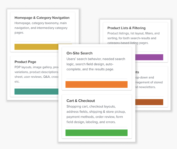
What Baymard assessed
- Homepage and navigation
- On-site search
- Product lists and filtering
- Product pages
- Cart and checkout
- Customer accounts
How it was assessed
- Informed by more than 150,000 hours of large-scale usability testing
- Benchmarked against more than 500 UX best-practice heuristics
The four big problems
Browsing was overwhelming
Key issues
- Overlapping categories
- Too many navigation paths
- A visually cluttered homepage
- Ads and sticky elements distracted from product discovery
Impact
Users struggled to find products and lost confidence early in their journey.
Ads and sticky elements competed for attention
Key issues
- Too much ad-like content
- Poorly balanced size, placement and visual integration
- Customers were met with four intrusive banners or sticky elements on arrival
Impact
Legitimate content risked being perceived as advertising, negatively affecting customers’ first impression of the site and brand.
Product discovery lacked clarity
Key issues
- No filters on PLP
- Product shades and variations appeared as separate products
- Only one variation was represented on each product card
Impact
Customers could not easily narrow, understand or compare their options.
PDPs made decisions harder
Key issues
- Product imagery, swatches and essential information were split across the page
- Copy was overly marketing-led
- Important product details were buried or inconsistently presented
Impact
Customers experienced high cognitive load at the point of purchase.
Turning insight into action
With a small Product Design team, I led the translation of Baymard’s “Poor” UX rating into a prioritised roadmap of quick wins and longer-term improvements across browse, PDP and checkout.
We focused first on the highest-impact violations, using existing components and content rules to improve clarity and usability without significant engineering overhead.
1. Restructuring navigation
What we found
- Categories were lengthy and overlapping
- Tappable elements were incorrectly sized or inaccessible
- Level-two menus created unnecessary visual clutter
What we changed
- Improved navigation usability and accessibility
- Simplified level-two menus
- Reworked the information architecture around real shopping behaviours
- Used UX best practice and competitor analysis to inform the new structure
- Partnered with Content to implement the changes in Contentful without engineering support
2. Reducing homepage clutter
What we found
- Too many banners, pop-ups and sticky elements
- The homepage felt cluttered and overly promotional
- Customers struggled to focus on product discovery
What we changed
- Consolidated trade banners into a dedicated always-on section
- Reduced hero copy to one clear headline and CTA
- Removed or delayed non-essential login prompts, chat triggers and pop-ups
For more information on this view, see the project Premium Experience Redesign of CharlotteTilbury.com.
3. Improving product discovery
Product shades and variations were displayed as separate list items, with no meaningful filtering and only one variation represented on each product card.
We designed a clearer parent-and-child product-card pattern that grouped related variations, surfaced shade choices and made products easier to understand and compare.
4. Simplifying product decisions
What we found
- Product images and shade swatches did not appear within the same viewport
- Selecting a swatch changed imagery that customers could not see without scrolling
- Product imagery and video were scattered throughout the page
What we changed
- Moved key product information higher up the page
- Positioned the image gallery and shade swatches within the same viewport
- Allowed customers to see gallery updates as they selected shades
- Consolidated product images and videos into one gallery
The longer-term vision
The audit also shaped a broader roadmap for improving the complete shopping experience.
- More readable and accessible UI through sentence case and cleaner layouts
- Faster decisions through visible swatches, AI-generated summaries and a clearer Shade Finder
- Simpler navigation through improved accordions and carousels
- Less purchase friction through sticky Add to Bag and stronger recommendations
- Clearer trust and value signals through improved reviews, virtual services and site-exclusive offers
From audit to impact
This work changed how the organisation approached experience quality. By translating a “Poor” benchmark rating into tangible, prioritised actions, I moved a series of low-effort, high-impact improvements into delivery quickly—improving clarity, trust and product discoverability without significant engineering investment.
More importantly, the audit repositioned UX from a reactive design function to a strategic product lever. It aligned stakeholders, secured long-term roadmap commitment and established a clear ambition: move the experience to at least a “Good” rating and continue towards best-in-class e-commerce standards.
More projects

Redesigning Charlotte Tilbury's Loyalty Club
A data-led loyalty redesign that reset the programme around customer needs
View project
Premium Experience Redesign of CharlotteTilbury.com
A premium, personalised and more intuitive shopping experience across the homepage, product listing pages and inline merchandising.
View project